MSUmaps
Mobile application designed to help students navigate Michigan State Universities sprawling campus
Identifying the Problem
In this project our team was tasked with identifying a design challenge faced by students at Michigan State University. While we explored many potential options one in particular stood out, navigation. At 5200 acres MSU has one of the largest campuses in the United States, posing a unique challenge for students when finding their way around. While there are many existing tools that attempt to solve this issue, we believed that by creating a design uniquely tailored to our users it could not only stand apart, but positively impact the lives of the MSU community.
Finding a Direction
With the design problem identified, we began by brainstorming a range of potential solutions. When narrowing down the options, we focused on ensuring the solution could support the following:
Solutions Should be:
Accessible to a wide variety of students
Scalable to allow for a campus-wide deployment
Technically feasible to implement in the near term
With this in mind, we evaluated our options and determined that a mapping application was the best choice. This approach would allow us to leverage the phone nearly every student has in their pocket, while incorporating innovative features, and personalized optimizations to create not only a compelling solution to our problem, but one that could offer a truly tailored experience for the user.
Understanding our Users
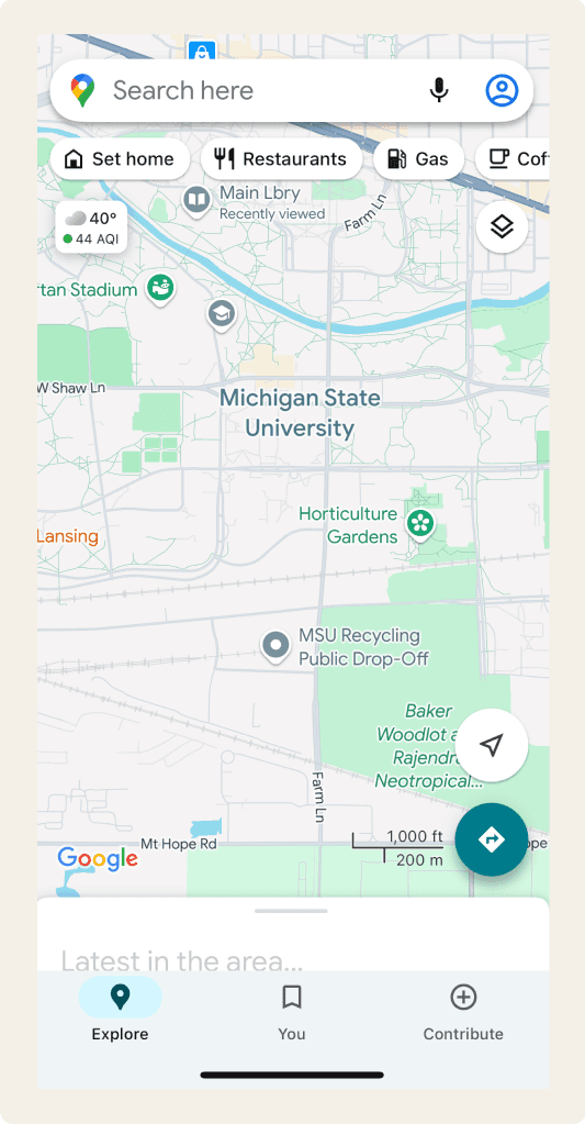
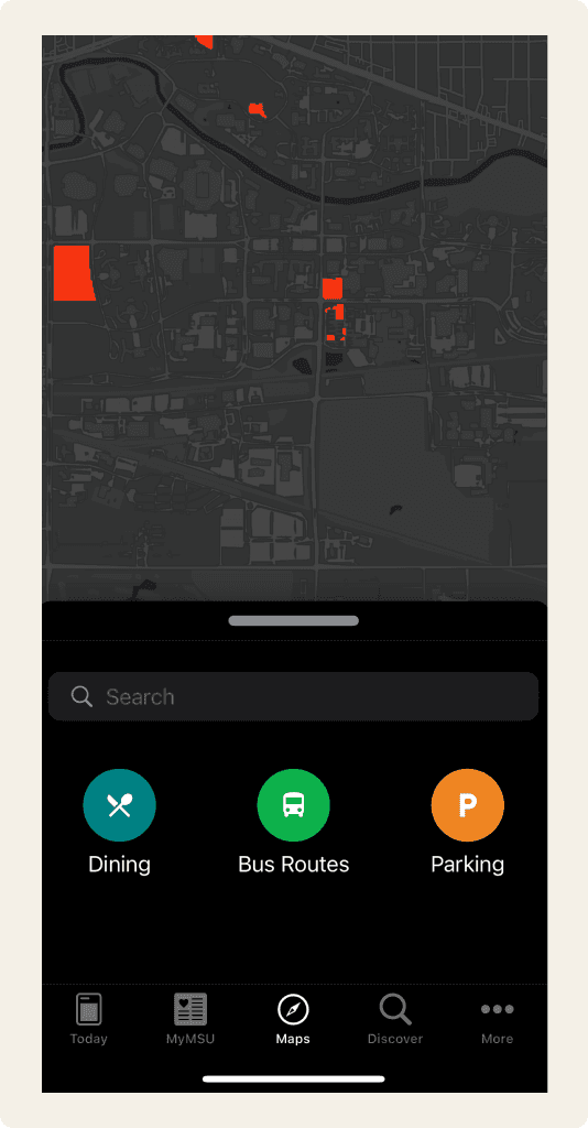
Our team began by conducting semi-structured interviews with students across campus to better understand the tools they currently use to navigate and their experiences with them. Through these conversations, we identified Google Maps and MSU's own mapping application as the most commonly used solutions. However, students consistently described these tools as inadequate, lacking critical features they where looking for.
Confusing directions
Unoptimized routes for walking directions
No Class Schedule Integration
No turn by turn navigation
Unintuitive and poorly designed
Lack of data on classroom locations
Following these conversations we conducted internal tests to evaluate the severity of the issues described by our participants.
Issue Testing:
Navigation by foot following the route provided by Google resulted in a average increase of 25-30% in total trip duration.
Google Maps offers the ability to save the locations of buildings you frequently visit but cannot pull this information from ones schedule.
Neither option had any knowledge of the internals of buildings or a way to direct you to a specific classroom.
These results demonstrated the validity of the problem and gave us a core set of issues to solve for with our design solution.
Designing a Solution
Our design process followed an iterative approach, allowing us to refine our solution at multiple stages. We began by creating user-flows, basic sketches, and wireframes following a few key design principles.
Design Principles that Guided Us:
Integrate intuitive navigation paths and minimize steps between actions
Utilize common design language and principles to ensure usability
Standardize typography and color schemes throughout
Maintain consistent visual feedback for user actions
With these initial designs I focused on taking what we learned from our user research and translating that to a user interface. I worked through the user-flow created by my teammate drafting rough sketches of each main path of the application. I rapidly iterated through multiple variations of many of the key views, allowing both myself and the team, to identify potential issues and determine the most effective solution to move forward with.
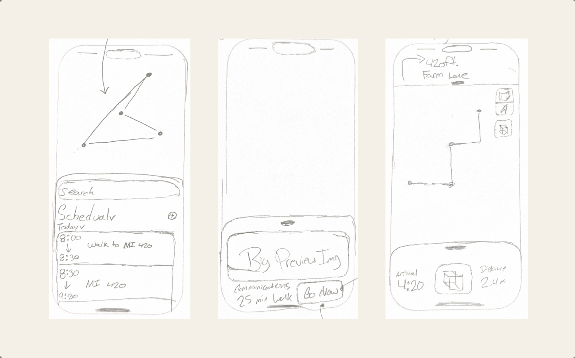
I scanned these initial sketches and used them to create a digital wireframe in FigJam. This intermediary step helped to understand the application hierarchy and relationship between views, while also serving as a easily accessible reference point moving forward.
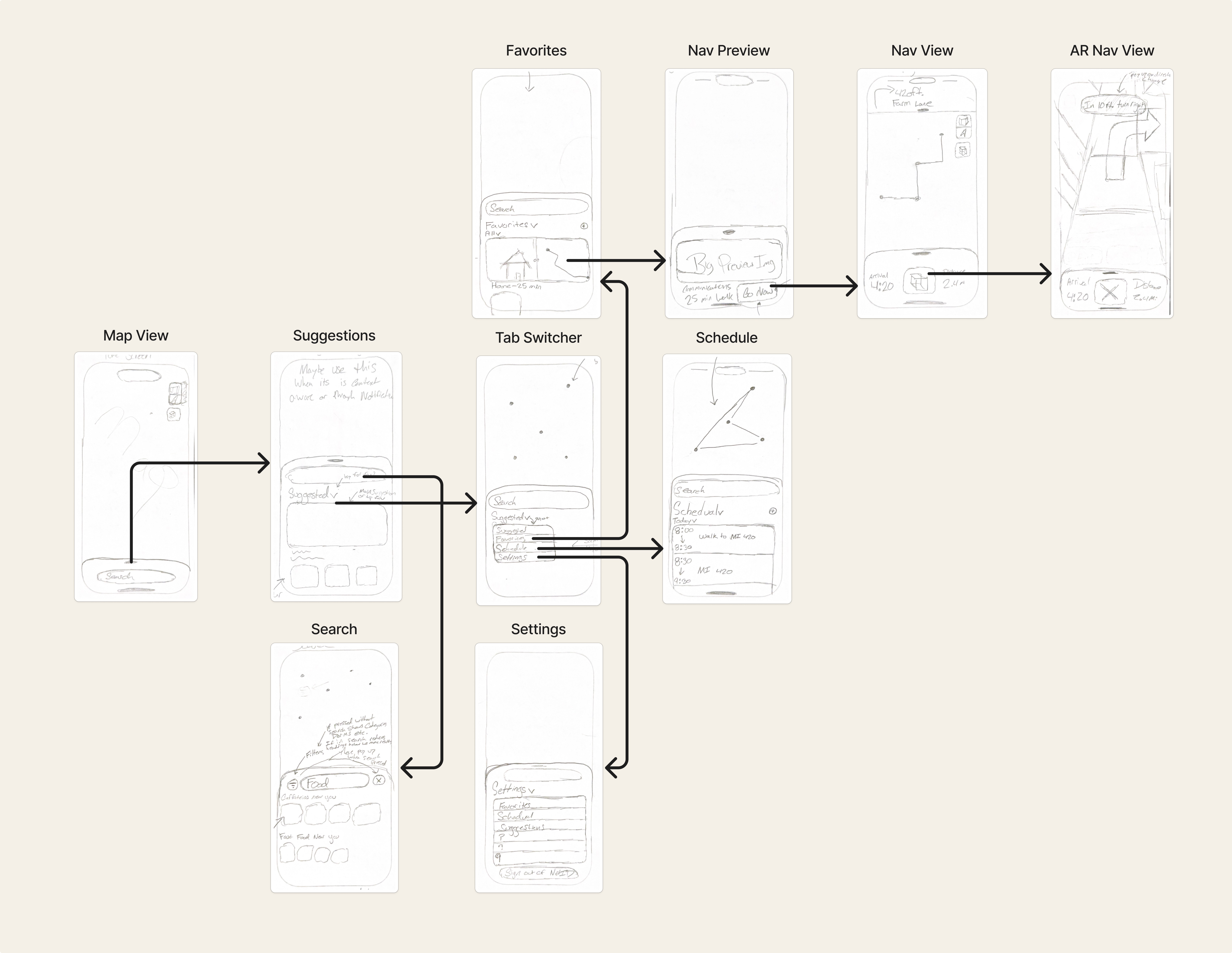
With these lower-fidelity prototypes complete, I began mocking up a high-fidelity version in Figma. I focused on creating components and views that provided clear navigation paths and intuitive interactions while remaining visually appealing. Through regular team meetings and design reviews, I continued building towards an interface capable of addressing the challenges highlighted in our research while maintaining simplicity and ease of use.
Key Features of this Initial Mockup:
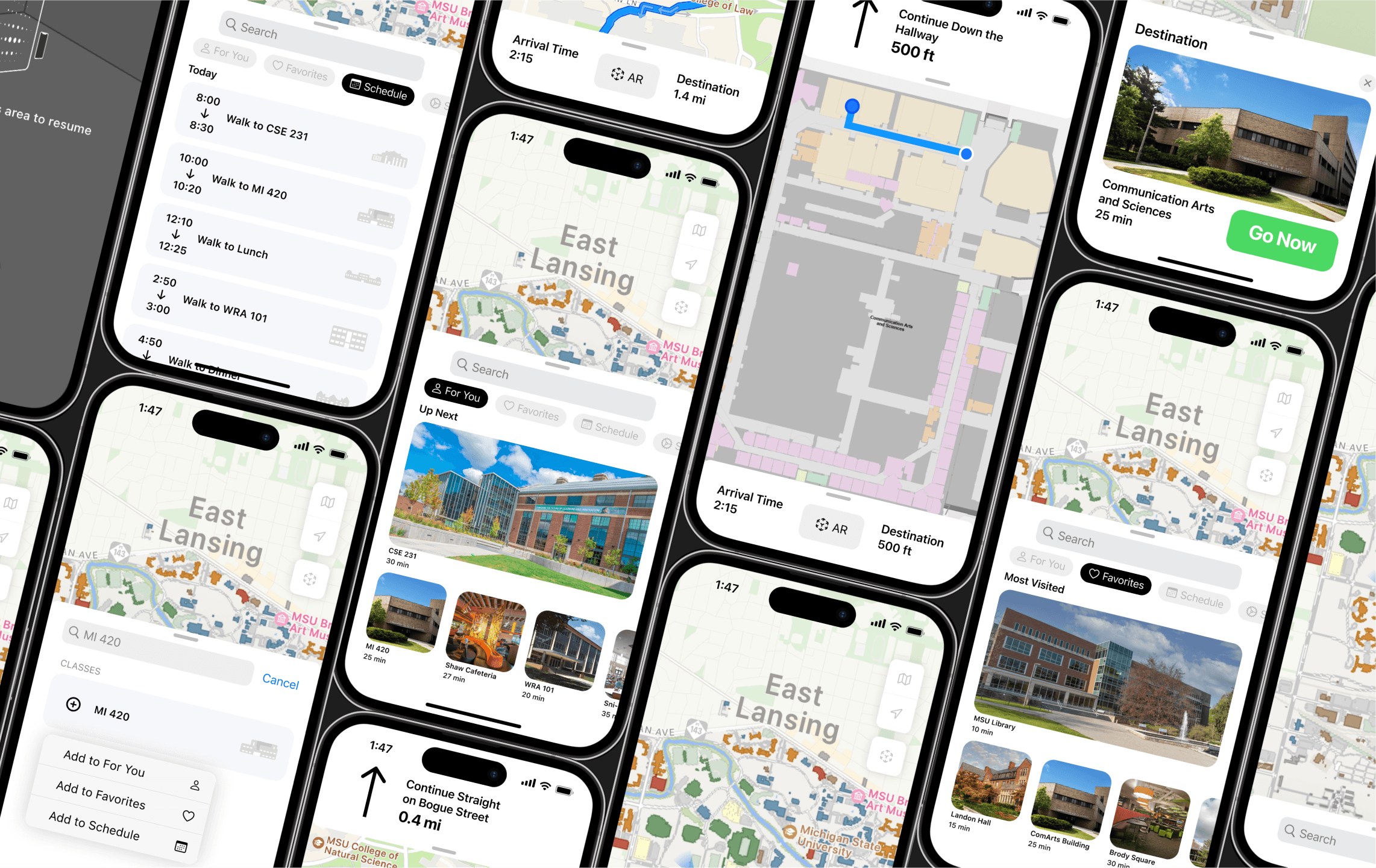
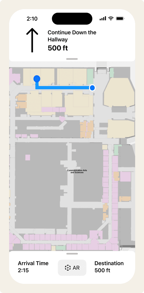
Confusion Mitigation: Integrated an augmented reality (AR) navigation view to show users the exact paths they should take in real time.
Classroom Navigation: Integrate MSU’s publicly available building maps to allow for in building navigation to specific classrooms.
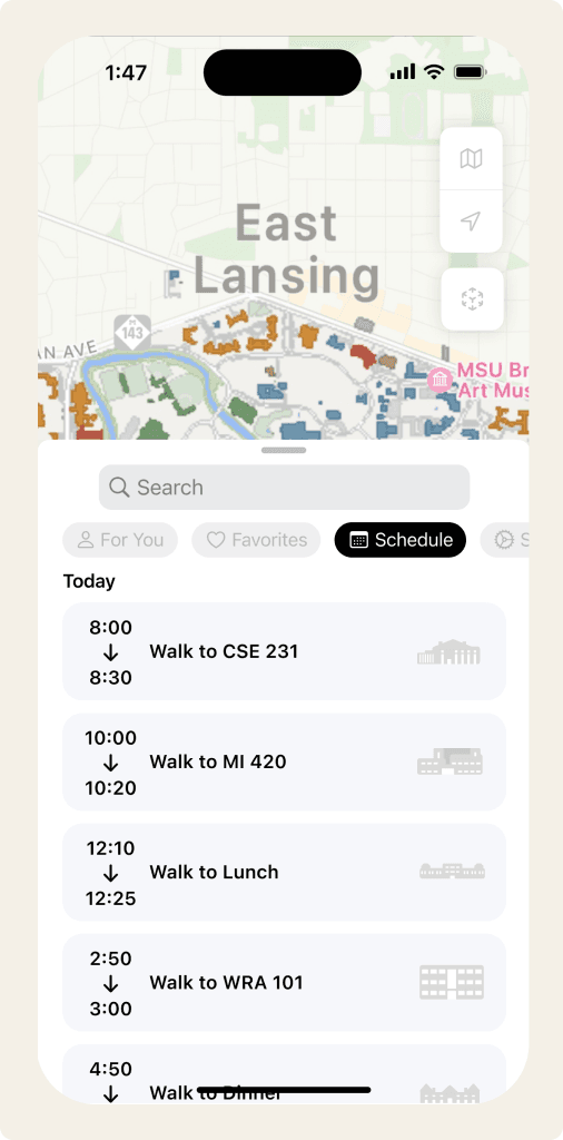
Schedule Integration: Integrate with students accounts to automatically sync their class schedules.
Route Optimization: Learns from previous trips to find the best path to the destination.
Classroom Navigation
Schedule Integration
Feedback, Iteration, and Refinement
To better understand how individuals interacted with the app and any pain points they encountered we conducted multiple user feedback sessions. These proved to be invaluable leading to several key improvements to our design. Participants were asked to "Think Aloud" as they completed a set of predefined tasks inside of the application. After completing the session they also graded the prototype using the System Usability Scale (SUS).
Areas of Achievement
Overall system usability high with an average SUS score of 70.83
Prototype lauded for its “clean and simple design”
Areas for Refinement
Lack of understanding as to how the AR features would work
Confusion with UI elements including category drop down and sheet view
Based on this feedback, we divided to efficiently address the cited issues. While my teammates developed a video prototype to better demonstrate the design and use case of the AR features, I focused on refining our mockup in Figma. I reviewed recordings and transcripts from our user feedback sessions finding those who reported issues invoking the card view where tapping the card rather than dragging. As such, implementing both interaction methods provided a straightforward solution that was easily integrated. However, the category selection presented a more complex challenge, and given its crucial role in navigation, I determined a new element would need to be created that could better communicate its functionality to the user.
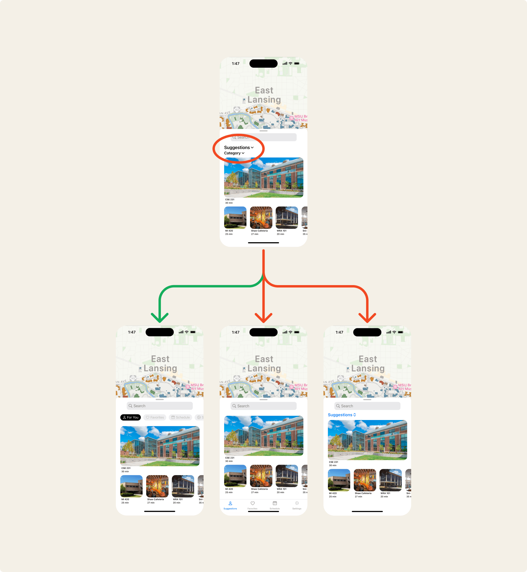
I mocked up multiple new versions of the element in Figma and conducted a series of A/B testing sessions to determine the most successful. Those testing the chip group implementation provided the most positive responses. An average SUS score of 82.35 from this group indicating a marked improvement to the usability of the element, and a viable solution to the issue.
Final Design
By addressing the challenges highlighted by our user testing, we had reached the end this project. Our final design stands as a comprehensive solution to the challenge of navigating MSU’s campus, one that integrates the needs of its users at its core and capable of positively impacting the lives of MSU Students.
Lessons and Reflections
This project offered valuable insights about designing effective user experiences, particularly when working to improve upon existing solutions. Here are some key learnings that will inform my approach in the future:
Innovation must be balanced with practicality
Initial assumptions should always be validated
User feedback revealed unexpected usability challenges with common elements like card views and drop-downs
Early and frequent user testing is invaluable
Our iterative approach helped identify and resolve interface challenges before they became embedded in the final design
Cross-team collaboration strengthens design decisions
Regular team meetings and design reviews helped refine the interface while maintaining our core user-focused goals